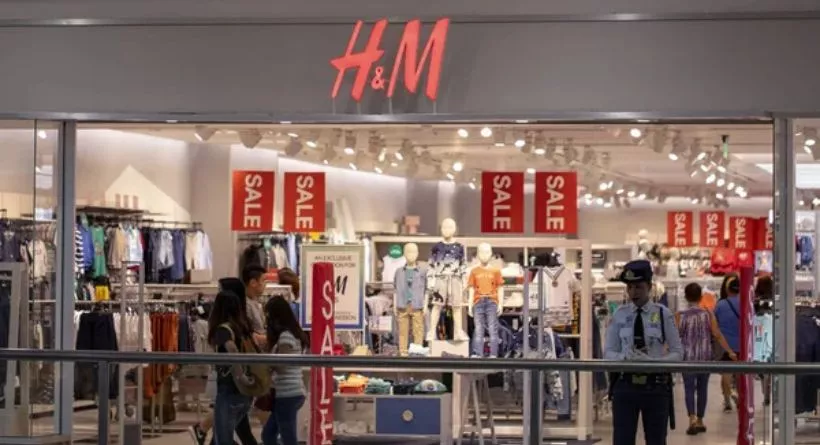
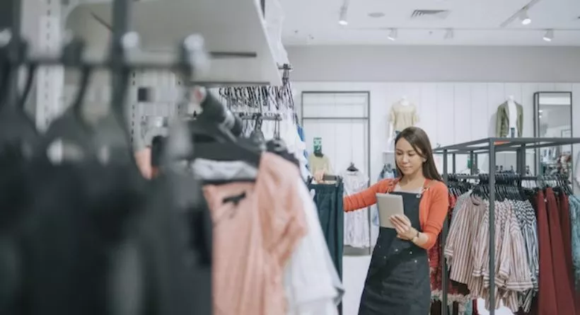
Despite the advent of online shopping and retail storefronts, 73.4% of consumers still choose going to physical places to make purchases. Therefore, it is essential to design your retail shop properly to make the most of your available space, promote customer-product engagement, and boost sales. Designing a plan for each business is unique and difficult, even though there are certain current common tactics that every retailer takes to increase their sales. It combines creativity, psychological insights, and analysis; it is both an art and a science.
The methods and resources you may use to plan the layout of your store will be explored in this post.
Step 1: Selecting Retail Store Layout
Your choice of layout will mostly depend on your available area, the kind of shopping experience you want to create, and the goods you offer.
There are several layout kinds, but six are the most common.
Grid: A straight layout is another name for the grid floor design. When consumers need to locate things fast, convenience and supermarket stores frequently adopt grid floor designs. Small enterprises can use it as well.
Loop: Racetrack layout is another name for this term. This design makes the most of the wall space while directing customers along a clear path. This design introduces customers to several items gradually. It is mostly utilized in retail clothing, accessory, toy, home, kitchen, and specialty businesses.
Free-flow/Mixed: The free-flow layout gives the merchant the opportunity to highlight their brand through creative floor layouts and designs. Additionally, it is utilized in clothing, specialized brands, and mixed-use establishments like cafés with book displays.
Diagonal: In the diagonal floor design, the central area is open and has multiple displays. This floor plan is most frequently used by computer, electronics, and beauty & cosmetics businesses. In order to draw customers to specific items, this design emphasizes the creation of wide sightlines.
Forced-path: Also called guided plans, forced-path layouts feature an open entrance and a single pathway to steer customers around the business. This strategy is used in furniture retailers like IKEA and encourages impulsive purchases.
Angular: The angular floor design places modest displays in the middle of the shop to draw attention to special offers. High-end jewelry, designer, and handbag businesses frequently employ this floor layout.
Which retail shop layout will be most successful entirely relies on the brand image, the items, and the customers. Combining two or more layouts has proven successful for many shops.
Making a choice based on data may be accomplished by evaluating the effectiveness of various layouts or combinations using Ariadne’s analytics tool.
The number of users who have visited the Outdoor Shoes area is seen in the figure above from Ariadne’s dashboard. But if the store layout had been different, the number of visits may have been 500 and the stay time would have been greater or lower than 331 and 7.8.
Your cross-sales performance is also impacted by your choice of layout. You may anticipate a significantly larger return if your business is set up properly and the items are strategically positioned. How can you tell if the location or design is effective? You may factor in your sales data, establish several tactics, and assess the difference while also comparing the amount of individuals moving between each portion and other sections. By doing this, you can guarantee that your business will finally have the finest performance.
Step 2: Design a blueprint of your store layout
Use digital tools to create or digitize your floor plan as an alternative. For instance, Ariadne allows you to sketch your own floor plan on the digital map and displays forecasts when you alter your layout, including those about the amount of visitors, dwell time, and more.
Step 3: Examine traffic flow & customer behavior
Customer flow is one of the key factors that your retail layout will affect. Whether to steer the consumer in a clockwise or counterclockwise direction is a topic of much controversy. However, logically speaking, the majority of individuals are right-handed, and as such, they naturally turn to the right and move around the business counterclockwise.
However, it relies on how the client behaves. Therefore, avoiding pain and encouraging a pleasant client experience are the major goals. You can offer the ideal customer experience by designing your layout to fit your clients’ natural purchasing preferences.
Step 4: Place your checkout & measure performance
The point-of-sale (POS) system, often known as the cash register, is located at the checkout area, where consumers pay for their purchases. The logical ending point in the purchasing experience that you have purposefully created could serve as a suitable generalization. For instance, if your clients tend to turn right when they arrive, then your checkout counter should be placed on the front left. However, your retail store’s size and layout also play a role.
The performance of the checkout area is just as important as its placement. It has a significant impact on total client satisfaction, which directly affects your income. You may monitor your checkout area’s performance in real-time, as seen in the above image, and take measures to reduce the waiting time.
Step 5: Use smart product positioning
Once your floor design has been displayed, you may begin product mapping. Place your items in a way that assures consumer engagement, results in a great customer experience, and increases sales.
Step 6: Optimize Products with Fixtures & Displays
Make sure that the supply of your products meets the demand of the market. Put enough distance between the items and the fixtures. The most essential thing is to provide clients ample personal space to browse your items in your aisles and on your displays.
Alternately, you may consider shutting a gateway to direct more customers to other items. Some goods with a high chance of conversion can be hidden away in the back, missing out on a lot of traffic. You may control the client flow by making a few adjustments to the layout and positioning of the products.
Step 7: Add Comfort Zones & Customer Amenities
Although the bulk of a store’s design is built on visual elements, other elements, such as adding aroma, touch, sound, and taste, may also significantly alter a store’s appearance and atmosphere. Design your store to engage as many of the customer’s senses as you can if you want to deliver a really fascinating in-store experience.
It’s a good idea to organize your products into tidy categories, but you can only do this if you have space for cross-merchandising. Find items in your business that would work well together, and then place them all on one display.
Step 8: Ensure Your Store Is Reachable To All
You can adhere to the ADA’s requirements to make sure that everyone can access your facility. Retailers must abide by a number of regulations to make sure that areas are commodious and easy to navigate. For instance, you could designate a specific parking space, maintain accessible restrooms open during business hours, keep the changing rooms clean at all times, and make sure your customers are aware of your features by posting accessibility information on your website and in-store signage. You could also train your staff so they can assist customer’s in-store.
Conclusion
In the end, these techniques will assist you in developing a retail layout that benefits both you and your clients. Your store’s layout has a direct impact on customer traffic, customer dwell time, and revenues.
Because of this, it’s crucial that you invest the time and money necessary to ensure that the appearance and atmosphere of your establishments are perfect. Don’t forget that the work should constantly be current when it comes to layouts and presentations. Therefore, continue looking for trends, update your product displays, and modernize your layout.
Ariadne may assist you in designing or redesigning your business by examining real-time visitor data without breaking GDPR regulations. Click here to get in touch with us and receive a free sample membership for one month while you learn more about this.
Do you want to precisely measure and evaluate your audiences in real-time without breaking GDPR regulations? To schedule a consultation with one of our experts and receive a one-month membership free, click here.


